Yes, this is a wordplay on The Colour of Magic by Terry Pratchett.
How do we render pretty colors? As a graphics programmer striking for greatness, it is paramount for us to understand how color works properly, and it’s not as easy as one sees. In order to understand how one sees color, we first have to take a look at the color matching experiment.
Color matching experiment
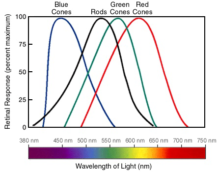
First, there are electromagnetic radiation. This is how we see color - these waves propagate through space, and went into our eyes, through the corneas, then lens, and finally landing on our retinas. If we zoom really, really far into our retinas, we can see that there are rods, which helps us see in dark, but doesn’t have much to do about color vision; then there are cones, which are the main guys that help us see.
There are three types of cones, called short (blue) cones, medium (green) cones, and long (red) cones, and they are basically responsible for us seeing the red, green and blue colors, respectively. When a photon with a specific wavelength hits the retina, cones are activated according to its frequency - photons with short wavelengths can activate short cones, while photons with long wavelengths activate long cones. Human perceivable wavelength ranges from around 400 to around 700 nanometers. Although it’s just a small part of the spectrum, a wide berth of colors are already available to us - and each of them is unique.
But humans have only 3 types of cones, and it is therefore physically impossible to have a photoreceptor for each wavelength. Our human body compensates this by having the three types of cones be responsible for a specific range of wavelengths, and then combine the result to produce a final color by using our brain.
This is why we have two ways to see yellow: from either equal amounts of red & green (as seen from above,) or from single wavelength yellow. While a spectrometer can distinguish them, we on the other hand will find absolutely no difference whatsoever. This is called “metamerism”.
Exploting metamerism, we can make colors in an additive way: by mixing red, green and blue, we can make all the colors our eyes can see. That’s cool, but mix how?
Here comes the color matching experiment. Conducted in 1920s by W. David Wright and John Guild independently, a blue, green and red light with single wavelength are chosen (later standardized as 435.8nm, 546.1nm, and 700.0nm.) The participants are shown two patches of light, one of them has single wavelength, and the other combined from the three primaries. Participants can change the light primaries’ intensities at will, in order to produce the perfect match for the color on spectrum. Like this:
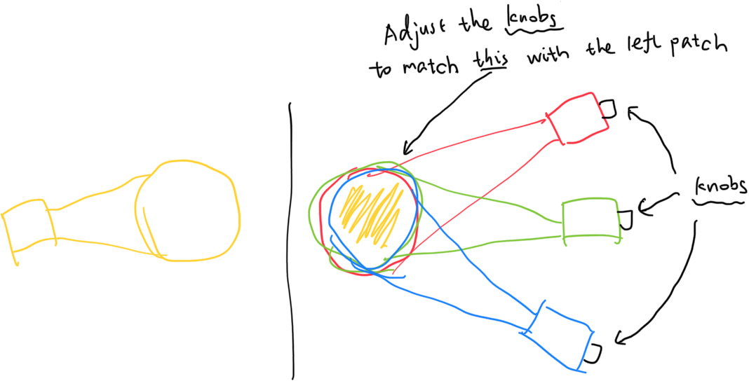
Each and every color on the spectrum has been matched in this experiment. The result is as follows:
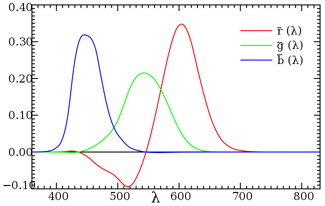
This graph later became known as the CIE (Commission internationale de l’éclairage) 1931 “color matching functions”. However, as we can see, the color matching function isn’t perfect - some parts are negative, and we can’t produce a negative amount of light. So how is that possible? In the original experiment, these colors are unobtainable by using the trichromatic primaries - so one primary is instead placed on the other side to compensate, until the participant matches both sides. Since the one light primary is placed on the other side (the most obvious part being a large chunk of negative red,) it becomes negative light.
Since again, negative amount of lights are impossible to produce, therefore making the CIE RGB color matching function impractical, CIE devised a new set of physically impossible primaries (tristimulus values) derived from the CIE RGB color matching functions, this time called XYZ, and made the functions into non-negative:
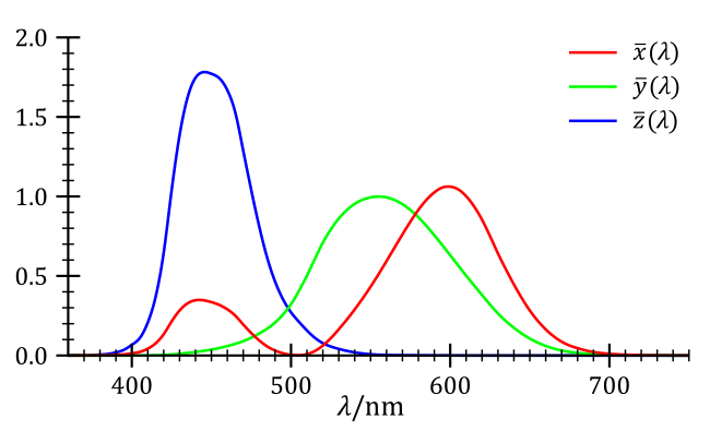
Even though it’s still infeasible to create the three primaries, by creating the XYZ color matching function, CIE has created a device invariant representation of color. As in, colors specified using the XYZ color matching function will be the same everywhere, for every device. Our phone, the traffic lights, old LCD screens, colored printers, they will all produce the correct color given the XYZ color coordinate. By tracing the color matching functions onto a three dimensional space, here’s what we obtain:
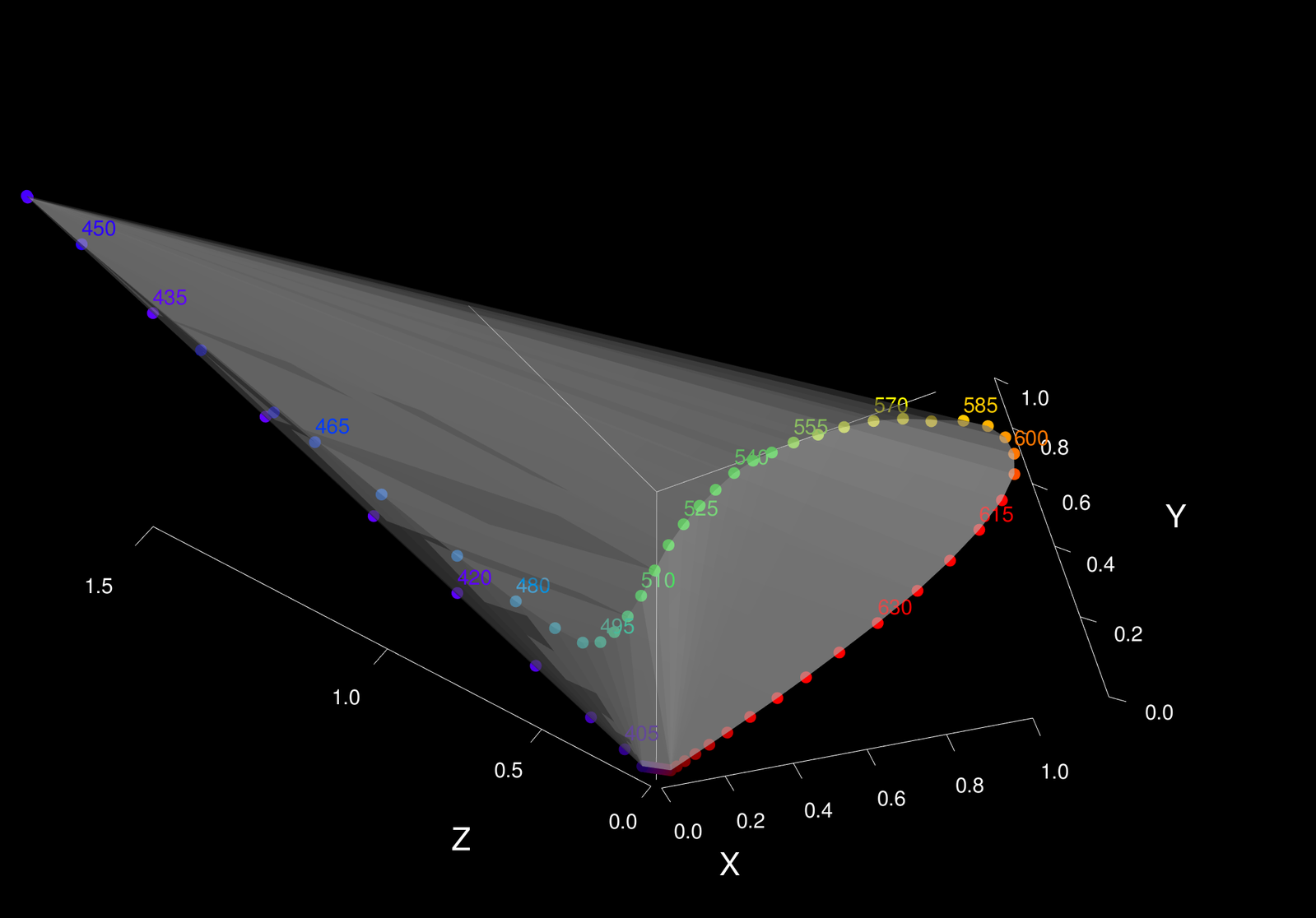
We can now simply the color space by dropping one dimension by defining a plane \(x + y + z = 1\), and projecting the XYZ color space points onto the xyz plane.
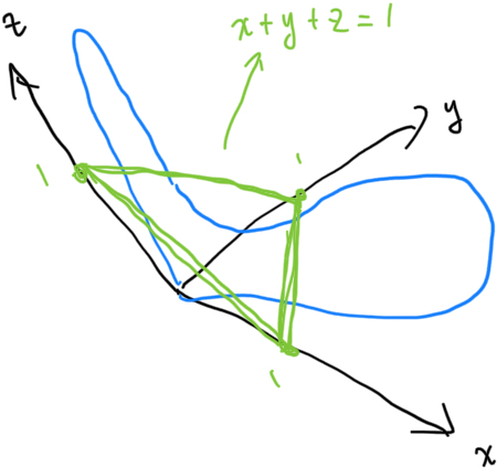
Doing so will trace out the famous color locus:
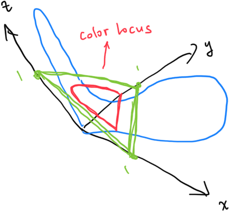
Since we have imposed the constraint \(x + y + z = 1\), \(z = 1 - x - y\), we can effectively drop the z coordinate. By projecting (again) the color locus onto a right triangle, because that’s obviously easier to work with, we get the CIE 1931 chromaticity diagram:
The Chromaticity Diagram
With the chromaticity diagram in hand, we can now represent all colors an average human can see with a two-dimensional vector (without intensity). Situated in the center \((0.33, 0.33)\) is equal energy white, also called the white point. The labeled numbers on the boundary indicates the wavelength of that specific color on that boundary, and as we can see, magenta-purple side doesn’t have such a boundary, because these colors do not exist on the spectrum. More on that later.
The chromaticity diagram is powerful because a lot of color operations can be done inside it.
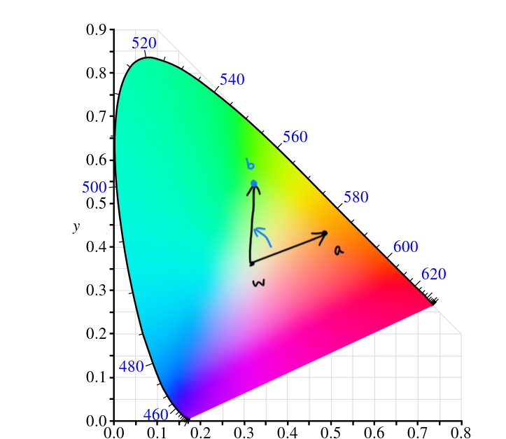
Color Mixing
Given two color coordinates a and b, we can mix them by calculating \(\frac{a + b}{2}\):
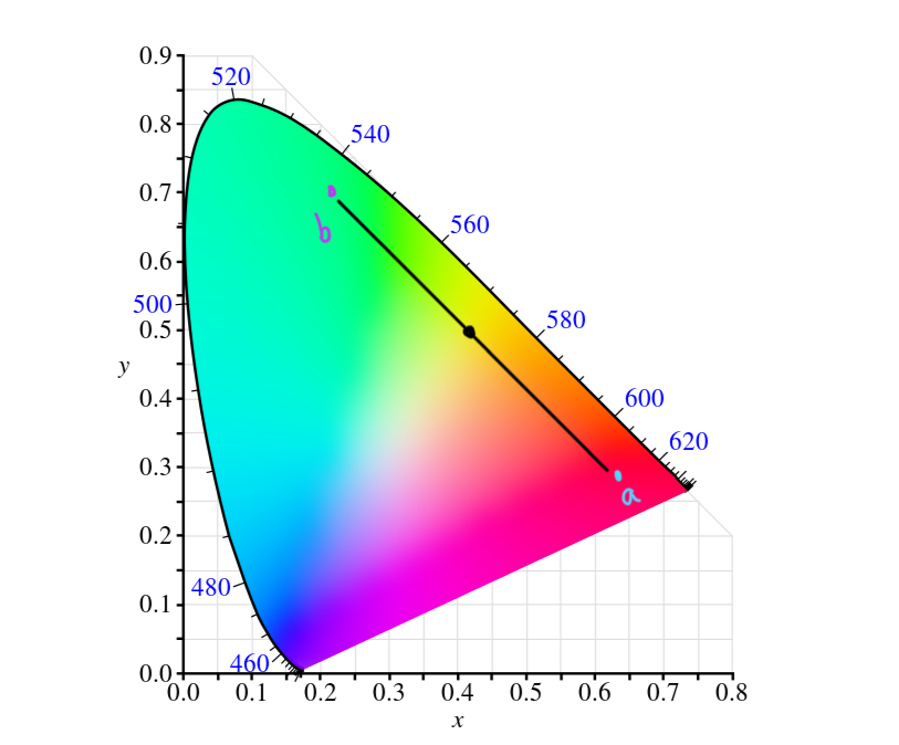
Complementary Color
Given a color coordinate a, We can estimate the complementary color by lining up a and the white point and see what color lies on the other side.
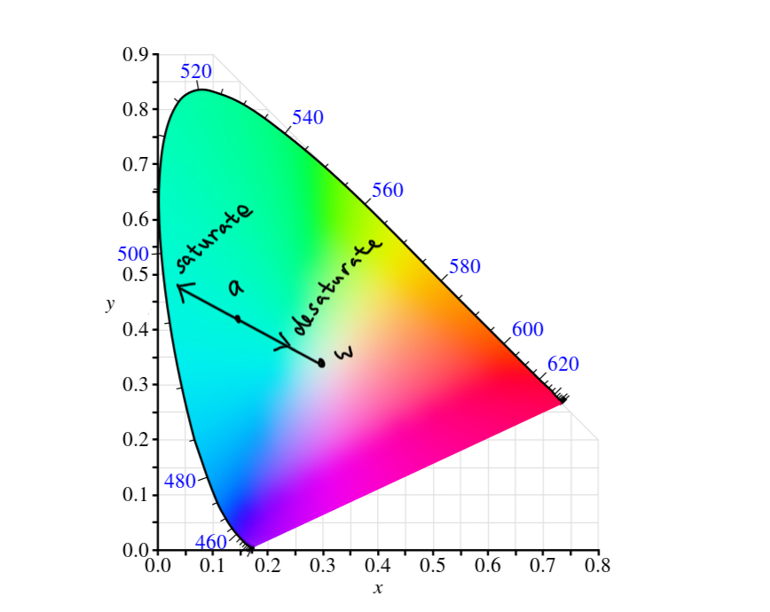
Color Saturation
Saturating colors make them more “pure”, and desaturating them makes them more “pale”. Given a color coordinate a, we can saturate color by lining up a and the white point, then move a towards the boundary direction; we can desaturate a by moving it towards the white point.
Hue Rotation
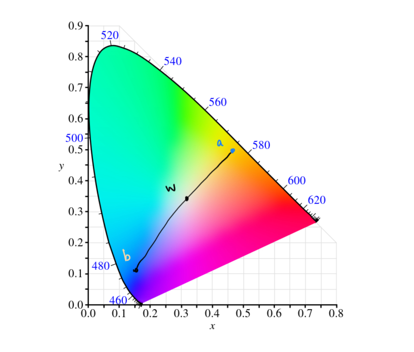
Hue rotation can be approximated by rotating \(x = a - w\) clockwise or counterclockwise, and see where \(w + x\) lands on. In actuality, hue rotation is not done via the chromaticity diagram, but rather a color wheel.
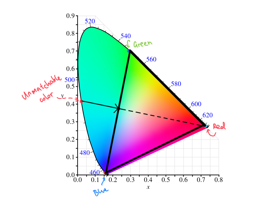
Color Gamut
Let’s go back to the original color matching experiment. In that experiment, we have three primaries with wavelengths of 435.8nm, 546.1nm, and 700.0nm. Plotting them onto the chromaticity diagram and we can see why some colors just can’t be matched - those three colors can only mix so many colors within the triangle. This is called color gamut, and given three single wavelength primaries, it is impossible to mix colors outside of their given gamut.
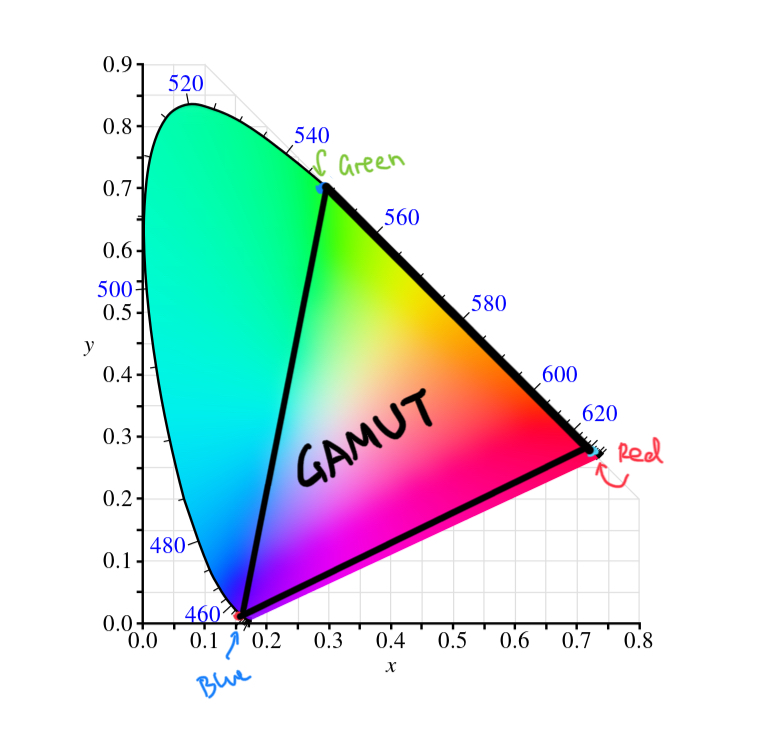
The original color matching experiment therefore compensates this flaw by placing light on the other side. By doing so, we push them back into the gamut, so that we can match it again.
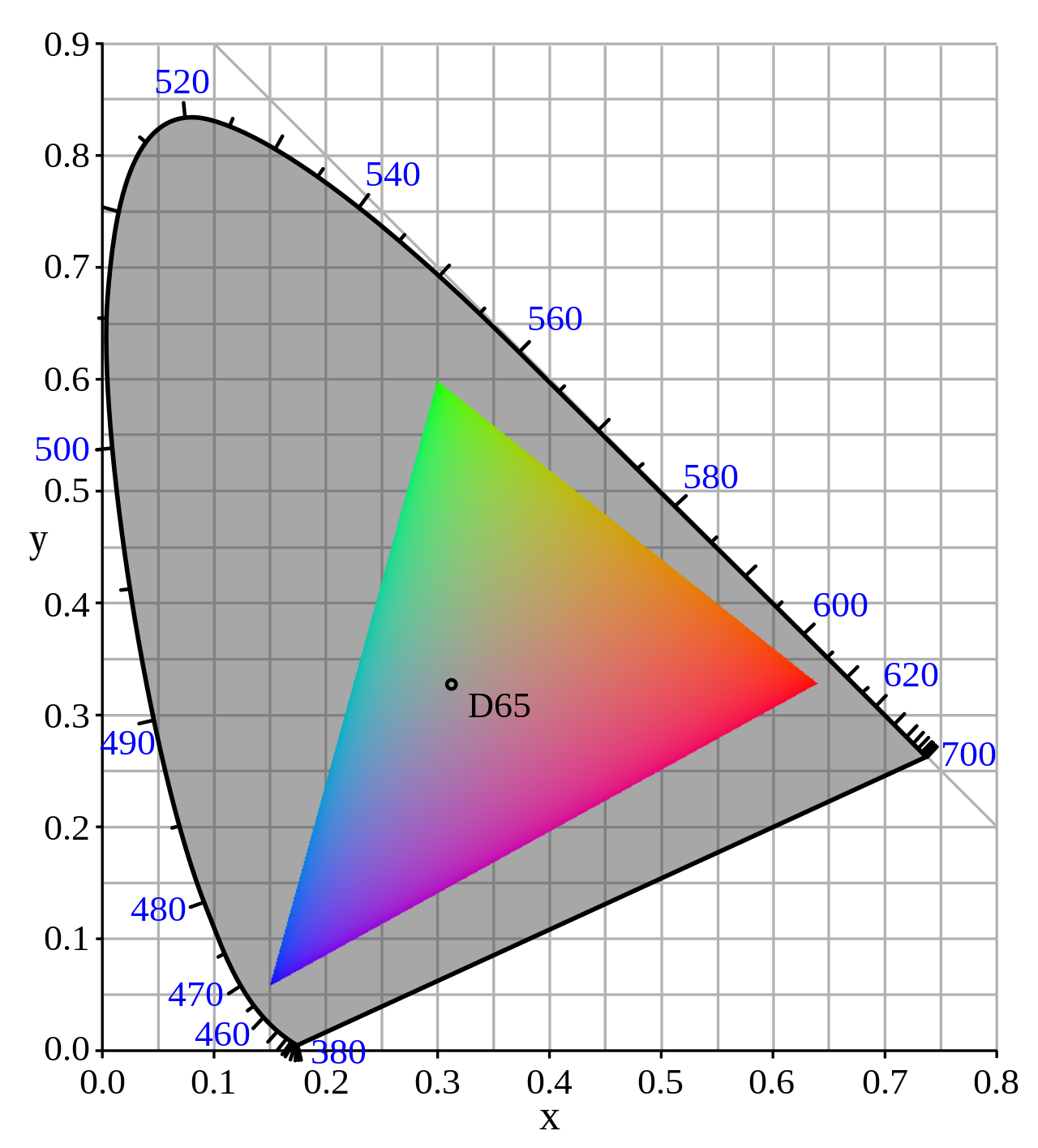
Our computer or phone displays are made using a lot of small red, green, and blue light arrays as well. This means our displays also have some sort of gamut. sRGB is another gamut defined by HP and Microsoft back in 1996, and is the gamut for the modern web, shown below.
Color White
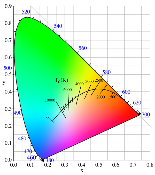
There are quite a lot of color whites. The most commonly used one is actually not equal energy white, and is instead D65, which represents the average daylight. There are lots of other color whites, such as incandescent light bulbs, tungsten lights, direct sunlight, etc. White points are also called illuminants.
Given an image, we can see how it exhibits in other illuminants by simply changing the white point (called “white balance” in photoshop and other image processing softwares).
Magenta & Purple
As we can see on the huge bunch of chromaticity diagrams presented above, there are no wavelengths labled on the magenta or purple side. This is due to the fact that this color does not exist on the spectrum; therefore, can only seen while being mixed. Specifically, purples can be proced from mixing red & blue. As a result, there are no pure spectral purple illuminants. Since red and blue are on opposite sides of the spectrum, our brain probably created color purple to make them look less weird.
Color Space Transformation
Given a standard color in xy space, we can now transform colors from xy space within the chromaticity diagram to any color space we want. sRGB, for example. To do that, we need to transform back to XYZ tristimulus values first. An additional number Y is required because luminance or light intensity is needed to elevate it back to three dimension. A set of equations are provided by Bruce Lindbloom:
\[\begin{cases} X = \frac{x}{y} \\ Y = Y \\ Z = \frac{(1 - x - y)Y}{y} \end{cases}\]After obtaining the XYZ tristimulus values, we can now transform to all kinds of RGB color spaces using pre-existing RGB/XYZ matrices.
Subtractive Color Model
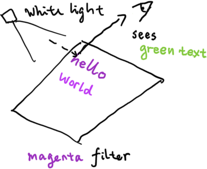
So far we have only learned additive color model, as in colors can be produced by mixing different colored illuminants. But this is not the only way to produce colors. As light waves propagate through the space, some wavelengths are absorbed by all kinds of filters. For example, the red & blue wavelengths are absorbed by chloroplasts in tree leaves, leaving only the green part of the spectrum entering our eyes, making the leaves look green.
When we place a red filter through a white light, the red part of the spectrum is absorbed, and we see color cyan. We see color yellow when we place a blue filter instead. This is how the CMYK (cyan, megenta, yellow, and black) subtractive model comes to be: by layering one filter on top of the other, we can create all kinds of colors. Color black can be created by layering all cyan, megenta, and yellow inks onto the paper, but that’s expensive, so black ink is provided separately.
…And More!
Humans have figured out a lot of ways to create color, however I am afraid we are running short on time. We have covered only the very basic of color science, including the color matching experiment, the chromaticity diagram, how to transform between XYZ and all kinds of color spaces, etc. We are living in a colorful world, and it is the magic of color that helps us distinguish between a purple grape and a green grape. Even though both are equally delicious, sometimes it’s good to have the ability to tell them apart, right?
References & Further Readings
- Basic Color Science For Graphics Engineer
- A Beginner’s Guide to (CIE) Colorimetry
- Colour: the open source Python package
- Color Vision 1: Color Basics
- Color Vision 2: Color Matching
- Color Vision 3: Color Map
- CIE 1931 Color Space - Wikipedia
- Additive and Subtractive Color Models
Comments